From Concept to Cohesion
Brand Journey: RedBit Development
Building a Cohesive Identity for a Bold Tech Partner.
Challenge
As RedBit prepared for growth, one thing was missing, a unified story.
Different teams described the company in different ways, and without a clear foundation, their brand voice felt fragmented. Their visuals and tone were outdated, their templates inconsistent, and their marketing collateral no longer reflected the innovative energy of the people behind the work. RedBit needed a cohesive brand strategy that captured who they were and where they were headed.
Solution
I began the rebrand by sitting down with the owner and executive team to truly understand RedBit from the inside out, their culture, their people, and what they stood for. The goal wasn’t to reinvent the company, but to evolve it while preserving its heart.
Through these conversations, I built a comprehensive brand system that reflected both their technical edge and human warmth.

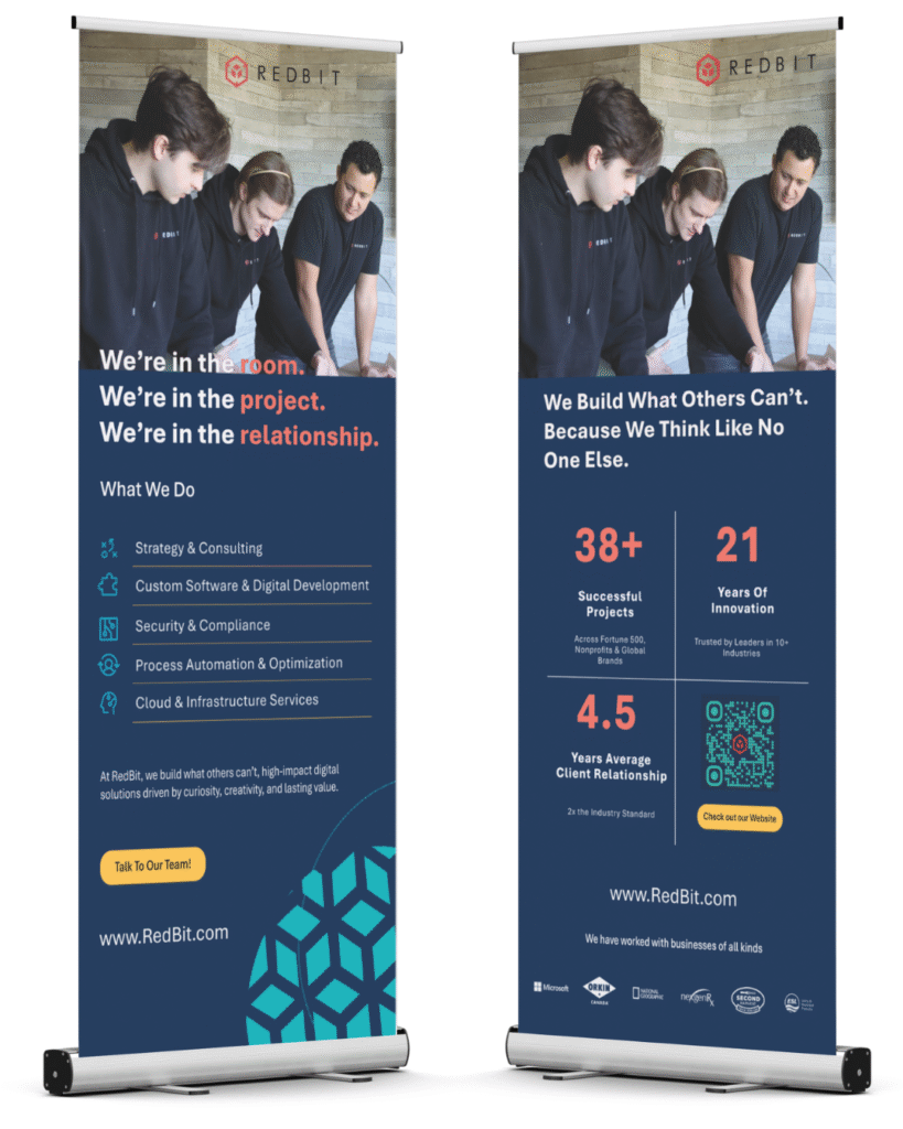
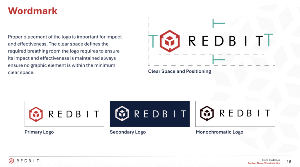
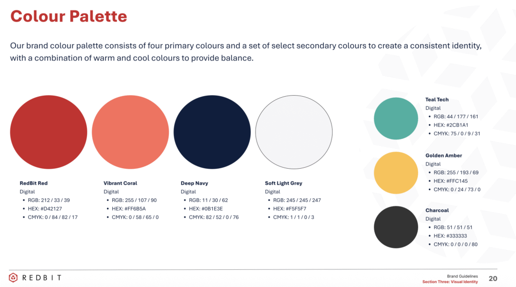
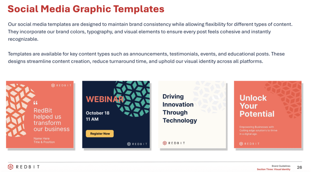
The work included a new brand guideline system, mission statement, slogan, values, and a refreshed logo and visual identity. I also designed a full suite of social templates, stationery, business cards, email signatures, LinkedIn banners, Teams backgrounds, website design, and branded merchandise.
My focus was on creating scalability and a tone that would carry consistently across every touchpoint—one that felt bold, modern, and authentically RedBit.
Outcome
The result is a brand that finally speaks with one voice.

RedBit now has a consistent visual and verbal identity that aligns the team internally and connects with clients externally. Their story feels unified and human, while their social presence and marketing materials project the professionalism and confidence of a company ready to grow.
RedBit didn’t just get a new look, they gained clarity, cohesion, and a renewed sense of pride in who they are.
Brand Guidelines